Beardy Beardy Finnieston
This was a fun project.. definitely used more yellow paint than I ever have on one job before. I was contacted by the owner to paint the main logo on the fascia and we just kept adding bits! They already have a well known shop in town with existing design and branding, and came to me with the logo and a vision for the colour scheme (yellow and black obviously!)
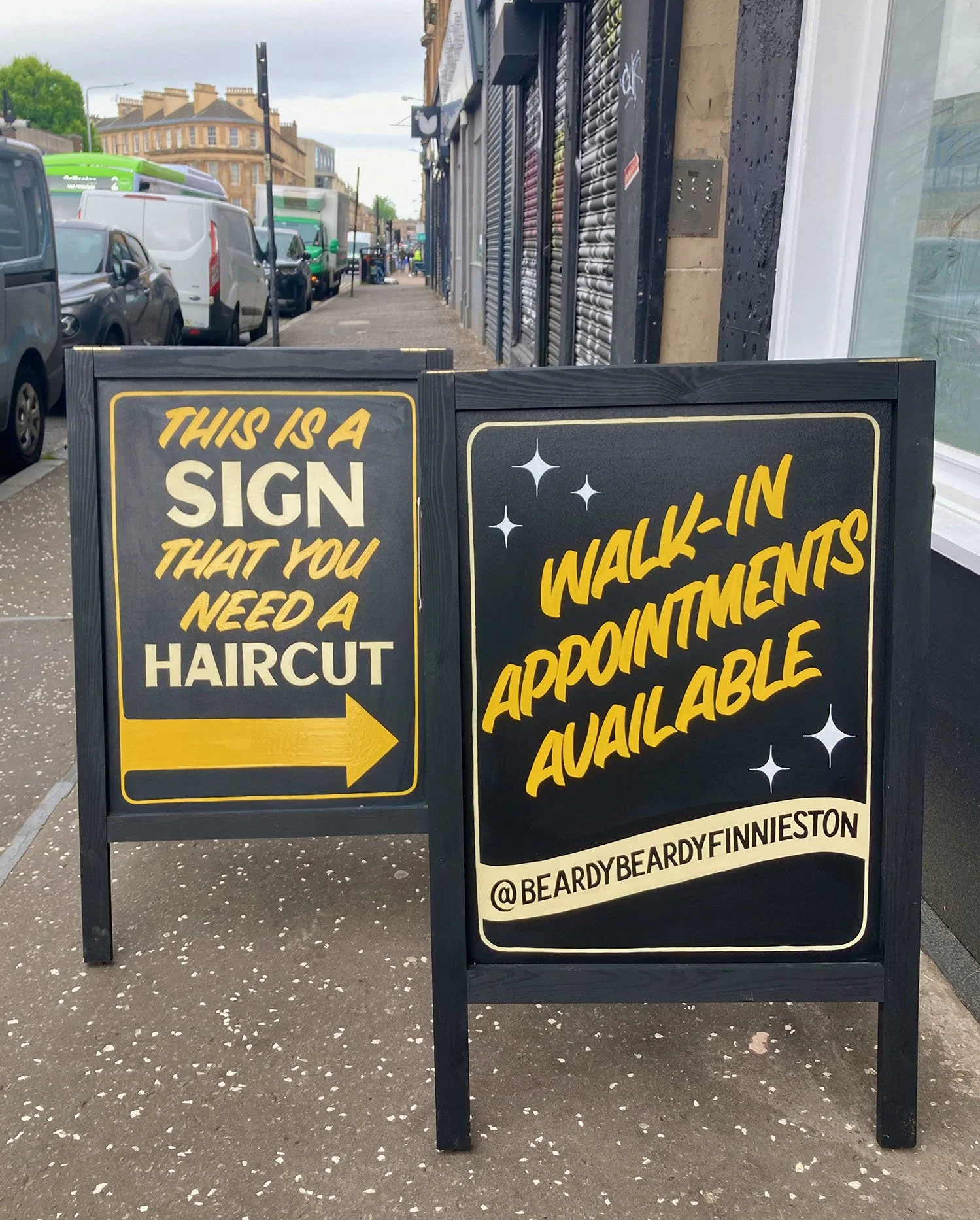
A couple of A boards desiged around the shops existing branding
They have really gone all out to create a next level space which in addition to barbering also has a cafe and a trainer refurbing service! The vibe is more like that of a tattoo shop and the attention to detail is incredible, the quality of the service they offer is definitely reflected in the branding.
This is a nice example of how hand painted signage creates character, the logo is repeated at a large scale several times on the shop-front which, if it was digitally produced might be a bit much but the fact it is hand painted softens things and makes it work.


